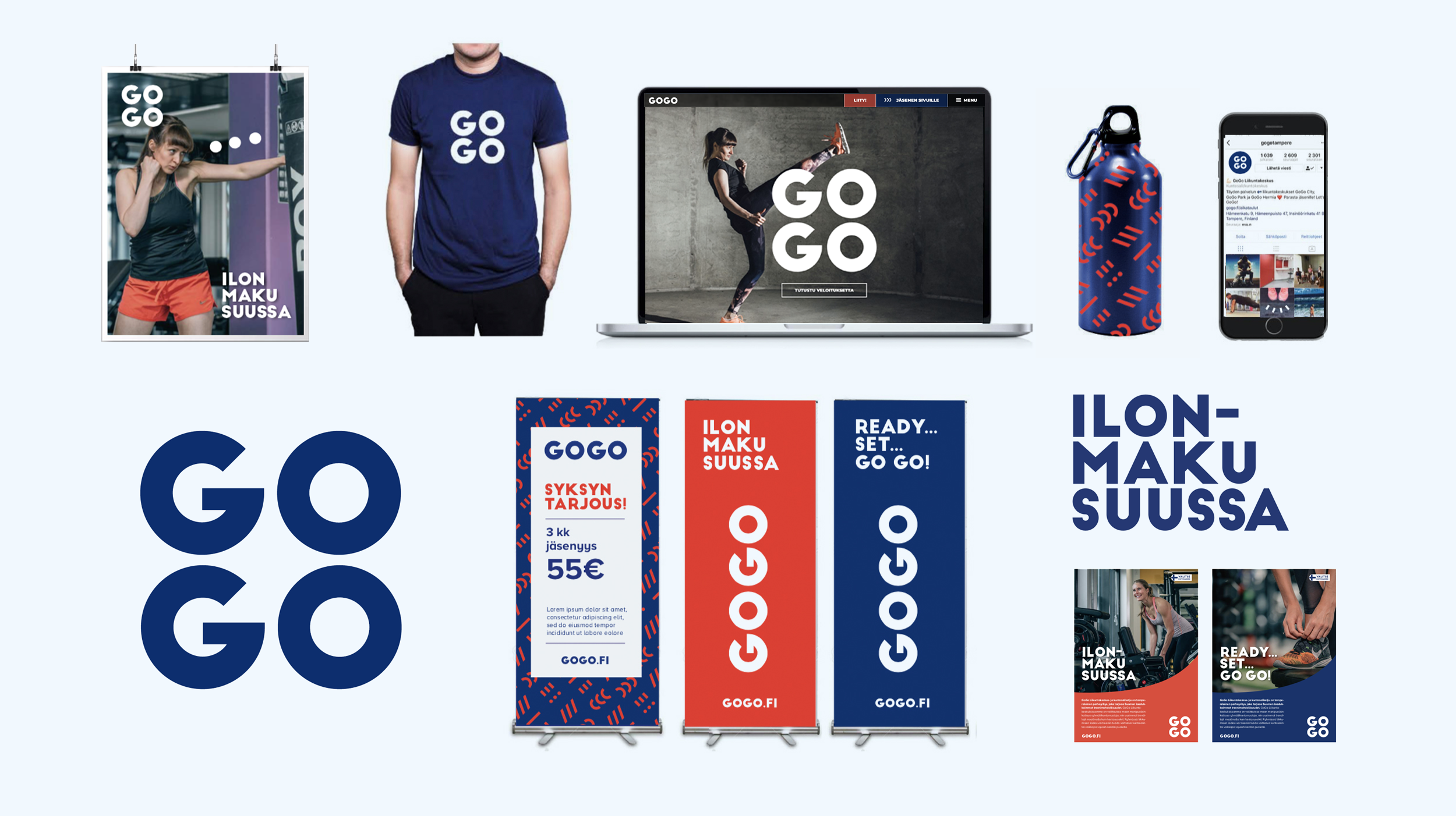
GOGO
Rebranding a fitness company to drive its national expansion


Challenge
A family owned fitness company GOGO wanted to refresh their brand image and visual identity to stand out in the toughening competition. Major international fitness chains were taking over the Finnish market while smaller national players were closing their doors one after another. GOGO had two brands: GOGO fitness centres, full service fitness centres with the newest and widest selection of workouts, and GOGO Express, budget gyms with excellent equipment and service.
Solution
We started out by defining what makes GOGO to stand out from its competitors: as a family owned company GOGO views all its customers and employees as members of its fitness family. So, we defined The Family as the core. In addition, with GOGO, the point of exercise spurs always from Joy, which lead us to create a slogan “Ilonmaku suussa” (Taste of Joy). These two ideas, family and joy, combined created an attractive and true starting point. To communicate GOGO’s essence visually we redesigned, with Aune Creative, the company’s visual identity bringing it playfulness, energy and joy. In addition to the rebranding project we have helped GOGO with workout launches, brand materials and media relations, among other things.
